Many traditional businesses are not weak products. They are weakly presented products. A factory may have reliable sourcing, consistent production, good materials and a capable sales team, yet the first thing an international buyer sees is a plain carton, a crowded label, a low-resolution catalog image or a product page that feels disconnected from the price the company wants to charge. Website design design for traditional businesses is not decoration after the serious work is done. It is part of how quality becomes legible. It is the surface where manufacturing confidence, market positioning and buyer trust meet.
At Bismatic, we often meet manufacturers and trading companies that already know how to make things well. Their challenge is that the visual system around the product has not evolved at the same speed as the product itself. The website presentation may still be optimized for warehouse identification rather than retail trust. The logo may have been designed years ago for a local catalog, not for Amazon, a distributor showroom or a European buyer presentation. The result is a gap between what the product is and what the market believes it is.
Problem analysis
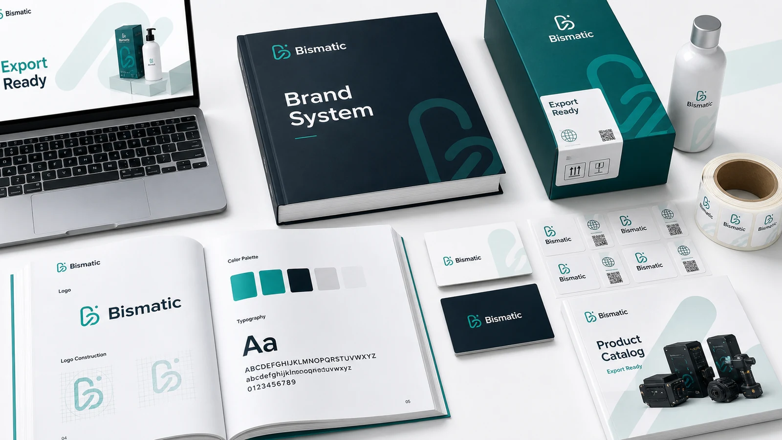
The most common mistake is treating website presentation as a single file: one homepage, one label, one dieline. In reality, website presentation is a small brand system. It has hierarchy, rhythm, touchpoints and moments of explanation. A buyer reads the front panel first, then the side information, then the usage icons, then the QR code, then the product photography online. If those pieces feel unrelated, the product feels less controlled. If they feel coherent, the buyer assumes the company behind the product is also more controlled.
For traditional businesses, the website presentation must also translate across cultures without becoming generic. European buyers tend to reward restraint, clarity and material honesty. Amazon customers need instant comprehension. Distributors want the product family to look organized on a shelf or in a PDF catalog. OEM clients need enough neutrality to imagine their own brand, but enough sophistication to trust the factory. These requirements can conflict if the design process is shallow.
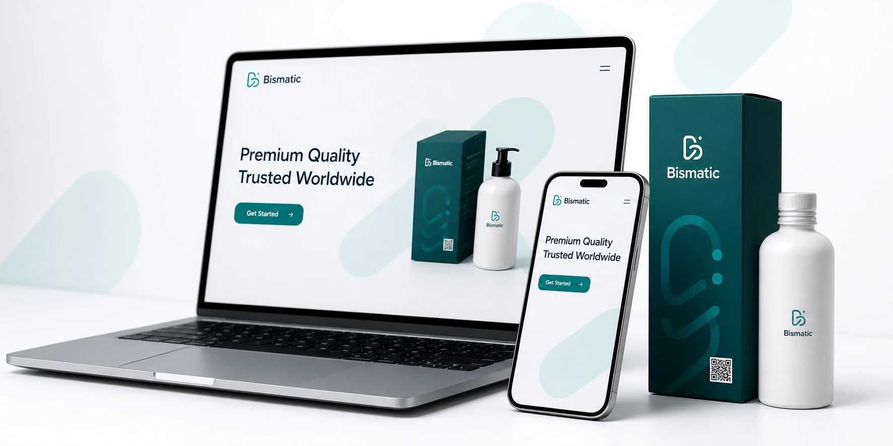
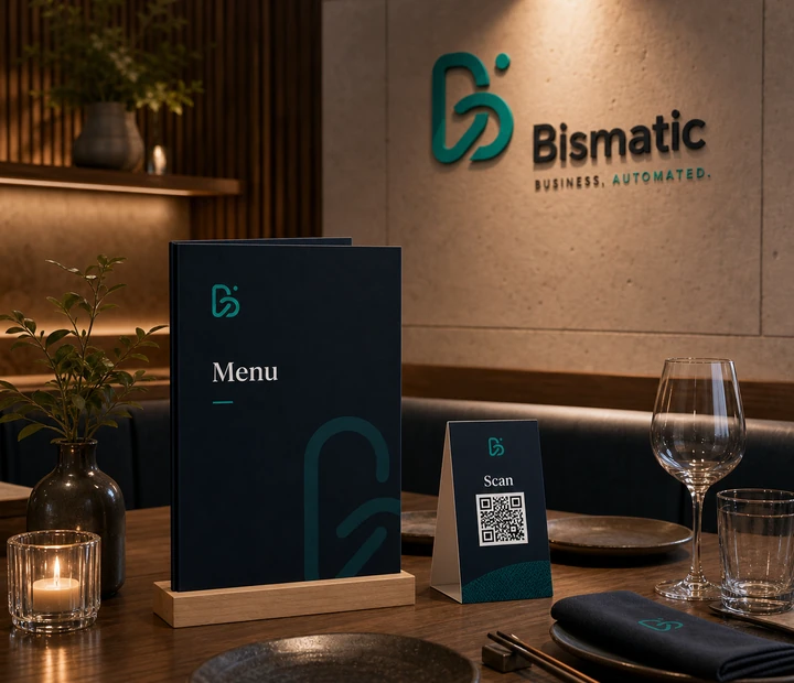
The website is not a digital brochure. It is the first room where an international buyer decides whether the company feels trustworthy.
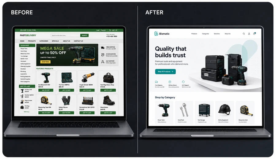
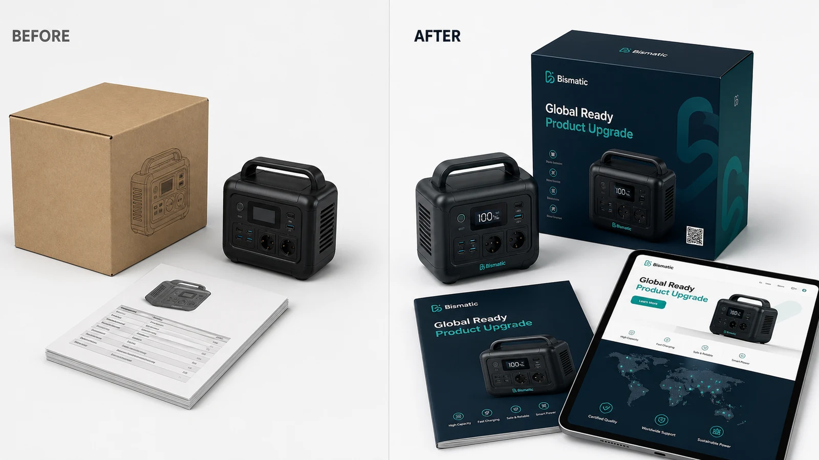
Before and after
A before-and-after website presentation redesign should not only show prettier colors. It should show a better argument. The before side usually contains the symptoms: too many claims, weak contrast, inconsistent icon styles, unbalanced product names and a visual tone that does not match the desired market. The after side should clarify what matters: what the product is, who it is for, why it is reliable and how the buyer should remember it.
The most effective transformations remove noise before they add style. They decide which claim deserves the front panel, which information belongs on the side, which technical details need icons and which details can live behind a QR code. This is how a package becomes calmer without becoming empty.
Transformation strategy
We start with positioning before pixels. Is the product competing on engineering confidence, lifestyle appeal, compact convenience, safety, sustainability or price-performance? Each direction produces a different website presentation language. A portable power station needs confidence, durability and technical clarity. A skincare product needs purity, sensorial calm and ingredient trust. A small industrial device needs precision, compatibility and reliability. The right design direction is not a mood board; it is a decision about what the customer should believe first.
A website presentation system also needs rules for future products. If every SKU is redesigned as an isolated artwork, the brand becomes expensive to maintain and hard to recognize. We define color logic, icon style, product naming, information density, QR usage and photography direction so the next product can inherit the same confidence.
Studio checklist
- Define the first belief the buyer should have.
- Remove claims that cannot be supported visually or commercially.
- Connect packaging, product imagery, website and sales material into one system.
Packaging system
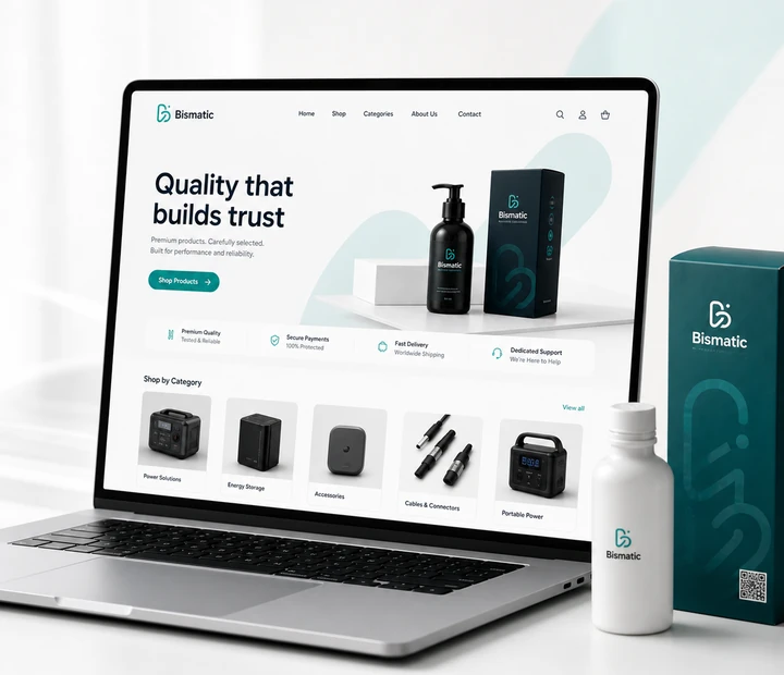
Good website presentation systems are built from hierarchy. The front panel should carry the brand, product name, primary benefit and one strong visual cue. Secondary panels can carry specifications, certifications, QR support, compatibility and usage details. The visual density must be controlled. A premium package is not empty; it is disciplined. It knows which information deserves silence around it.
Material choices matter because they create expectations. Matte finishes, restrained contrast and precise typography can make a product feel more stable. Loud finishes, inconsistent icons and crowded claims can make even a good product feel cheaper. The design should support the price point the company wants to defend.
Website connection
Website design rarely works alone. The QR code on the homepage should lead to a page that continues the same visual world. If the customer scans a premium package and lands on an outdated page, trust is broken. The website does not need to be complex, but it must confirm the promise: clean product photography, clear specifications, downloadable manuals, warranty information and a modern contact path.
The goal is not to make a company look fashionable for a season. The goal is to make the business easier to trust, easier to understand and easier to choose in a market where buyers compare many similar offers quickly.
Final thoughts
Website design redesign is one of the fastest ways to change how a product is perceived because it sits close to the purchase decision. But the best redesigns are not cosmetic. They are strategic acts of translation. They take real manufacturing value and make it visible to people who do not know the factory, have not visited the production line and may only spend three seconds deciding whether the product feels trustworthy.
How to judge whether the transformation worked
A premium transformation should be judged by clarity, not by decoration alone. The first test is whether a new buyer can understand the offer faster than before. The second test is whether the business can defend a stronger price, a more serious meeting or a more confident distributor conversation. The third test is whether the new visual system can be repeated across future products without becoming inconsistent. If the answer is no, the work may look attractive but it has not become an operational asset.
Teams should also review the transformation across touchpoints. Place the product image, packaging, website section, catalog page and contact screen side by side. If they feel like separate projects, the brand still needs alignment. If they feel like one company speaking with different levels of detail, the system is becoming mature. This is where premium design becomes practical: it reduces explanation, shortens doubt and gives sales teams better material to work with.
Finally, measure the work in the language of real business. Are buyers asking better questions? Are sales teams more willing to send the website link? Do distributors understand the product family faster? Does the company look more suitable for Western and global markets? These signals matter because brand transformation is not a gallery exercise. It is the careful conversion of existing capability into visible trust.
Related reading
Continue with the Bismatic Journal articles on packaging design, industrial product styling and website redesign.